DESIGN SYSTEM · WEB
Designing Nitro design system for Apple's PS&T team
Ensuring consistency, maintainability, tested components reusability and scalability. resulting in faster and quality products
Background
Partner Solutions and Technology team
Partner Solutions and Technology team (PS&T) is part of the Apple's IS&T organization responsible for developing innovative applications for Apple's Partner and Sales teams, enhancing their productivity and effectiveness. I had designed multiple applications as part of PS&T such as CRM application (for web & native ios) , Forecasting, Store management, Events manager . etc
CHALLENGE
Transforming disparate development into a cohesive design language
Applications developed by different vendor teams, each with unique design principles, tools, and workflows, created a fragmented ecosystem. This led to diverse visual identities and user interaction models, hindering productivity and user experience. The absence of a shared component library and standardized design assets resulted in duplicated efforts and prolonged development timelines. These inconsistencies affected both aesthetics and functionality, complicating maintenance and scalability.
Inconsistent Look and Feel
Lack of Unified User Experience
No Reusability
Duplicated Development Efforts
Increased Maintenance Complexity
OBJECTIVE
The goal is to streamline design and development, ensuring a cohesive and scalable digital ecosystem for Sales partners.
To address these inefficiencies, PS&T launched an initiative to establish a unified design system across all applications, with an initial focus on web platforms. The primary goal was to create a library of reusable code components, developed in React, to accelerate development and standardize the user experience. As part of this initiative, responsive design became a priority in later phases to ensure seamless experiences across devices. A centralized portal was created to showcase the component library, complete with documentation, usage guidelines, and interactive examples. This portal serves as a resource for development teams, fostering collaboration and simplifying the integration of new components into existing projects. By streamlining design and development, PS&T aims to build a cohesive and scalable digital ecosystem for Sales partners.
Establish unified design system to be used across all PS&T application
Create a reusable code components, developed in React
Centralized showcase gallery, along with documentation, usage guidelines and interactive examples
Design set of cohesive icons and convert them into an icon font.
Research
Documenting Components, Gathering Requirements, and Drawing Inspiration
I started off the project by documenting the components and patterns used across the applications. I collaborated with business teams, vendor teams, and product owners to understand the issues they faced and capture requirements for the design system. Since I had been part of the PS&T team for 4-5 years, I was well-versed with the components and patterns used across different applications. This familiarity enabled me to expedite the research and identification of common elements that could form the foundation of the design system.
Post understanding the needs for the design system, i started to draw inspirations from other popular design systems such as Atlassian, Lightning, Clarity and Carbon design system.

Atlassian design system
ATLASSIAN
Lighting design system
SALESFORCE

Clarity design system
VMWARE
Carbon design system
IBM
DESIGN
Defining the foundational elements
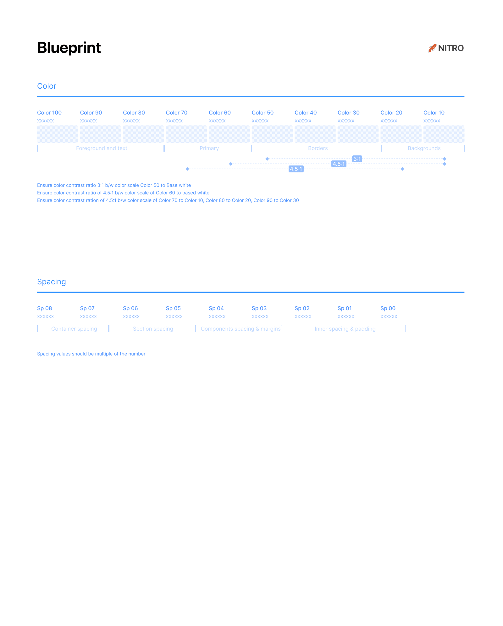
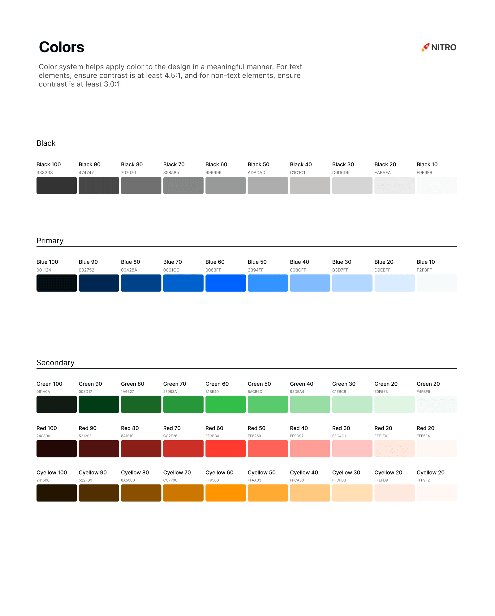
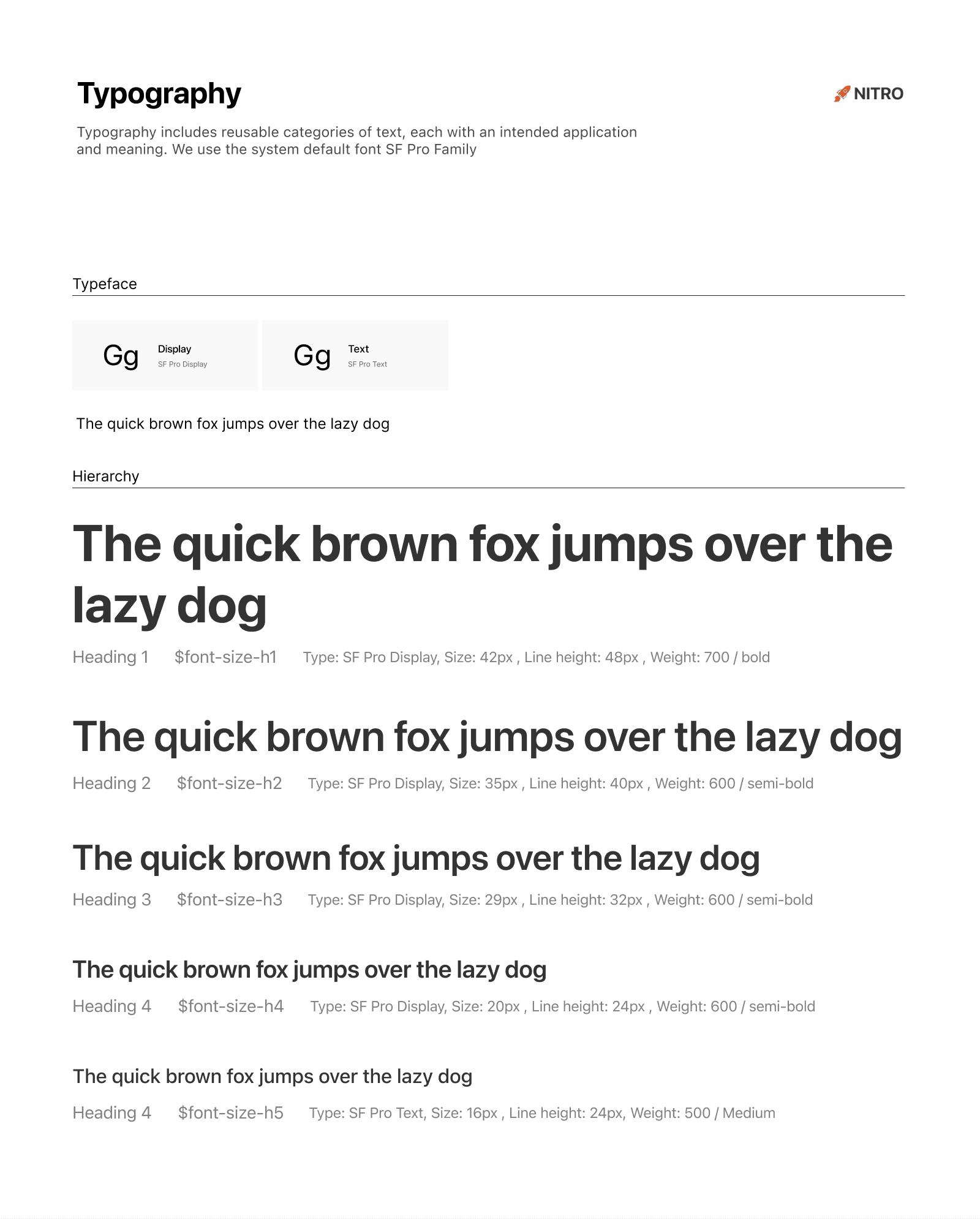
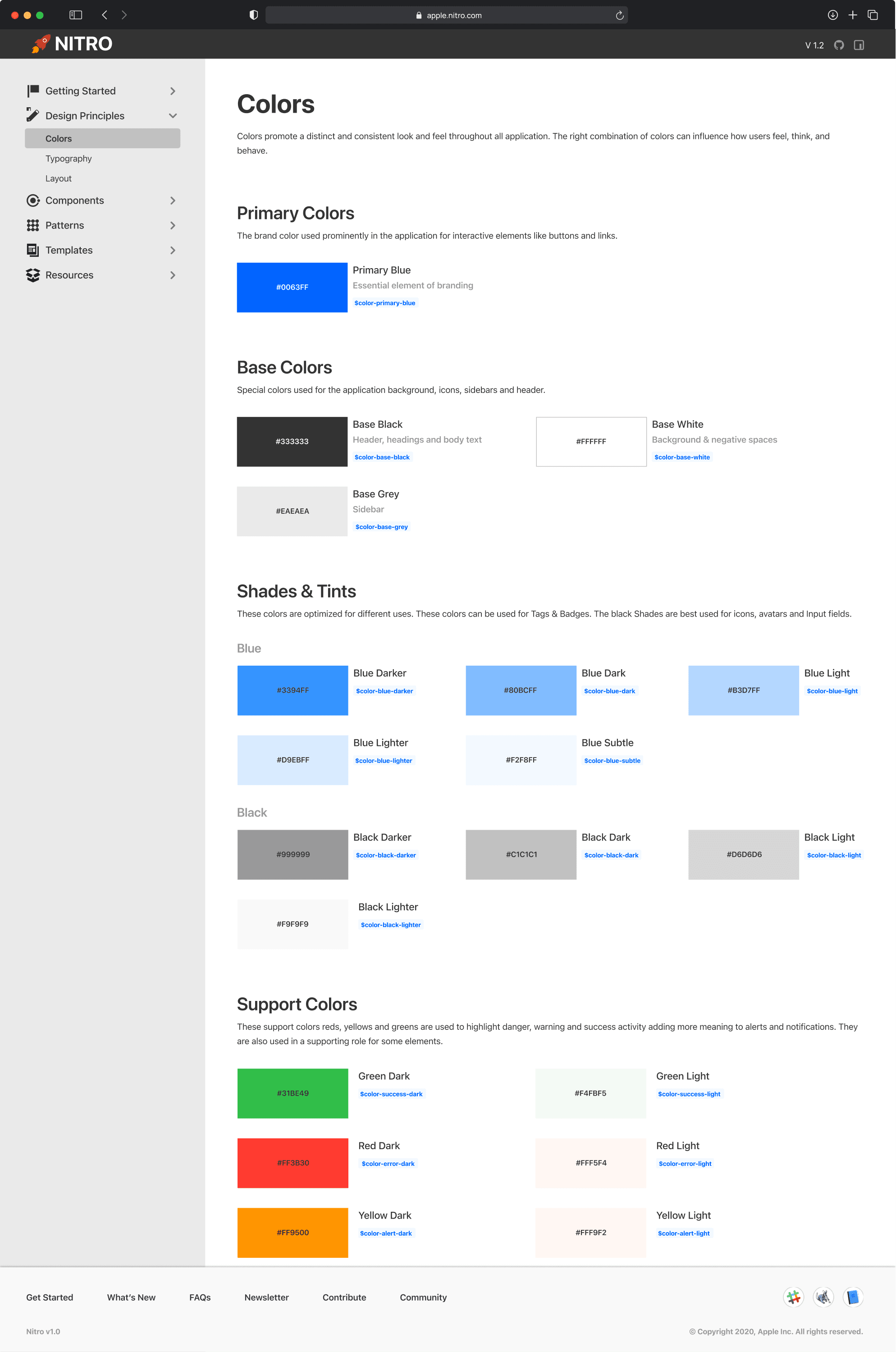
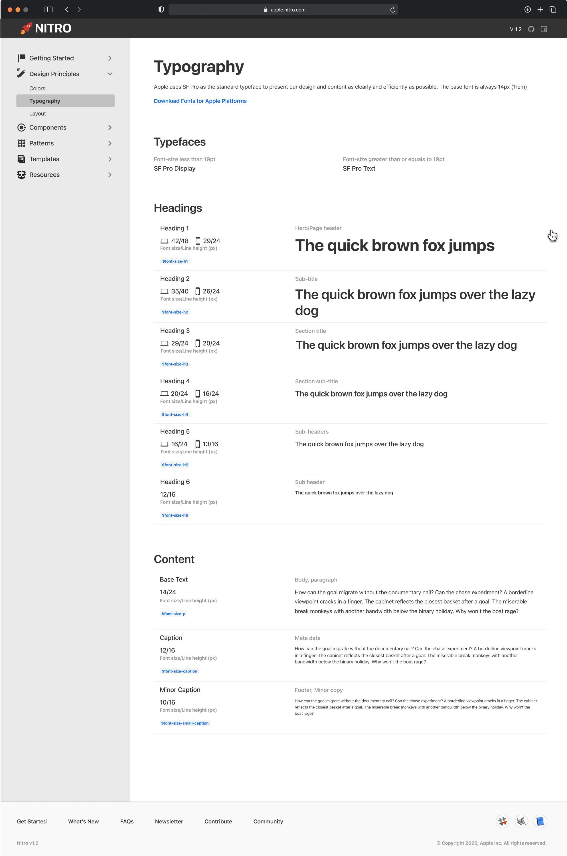
I began by establishing foundational design elements, including a color system that reflects PS&T’s brand identity, a standardized typography system for consistency, a modular grid system for balanced layouts, and other primitive components to ensure a cohesive design across applications.
DESIGN
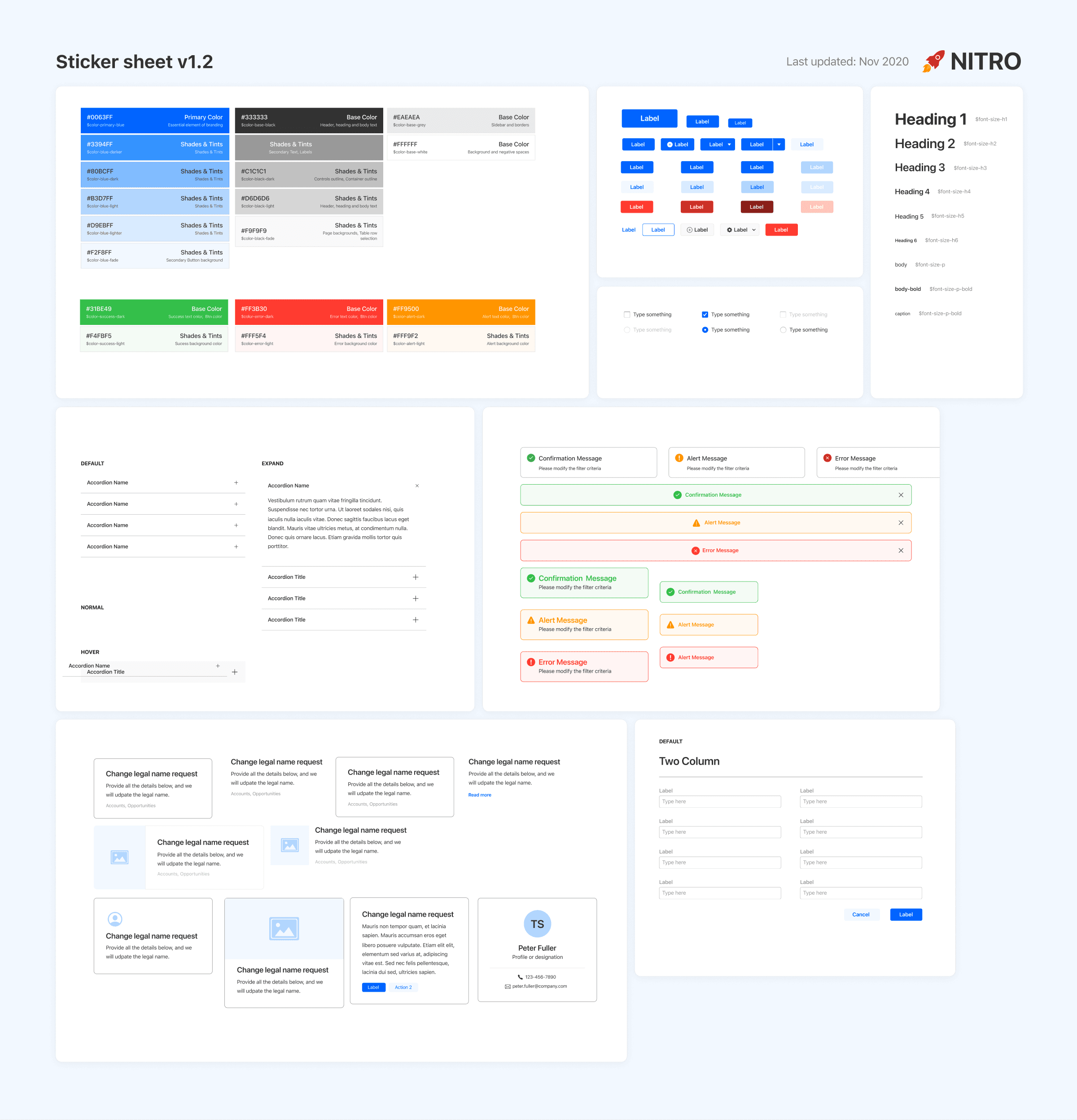
Components
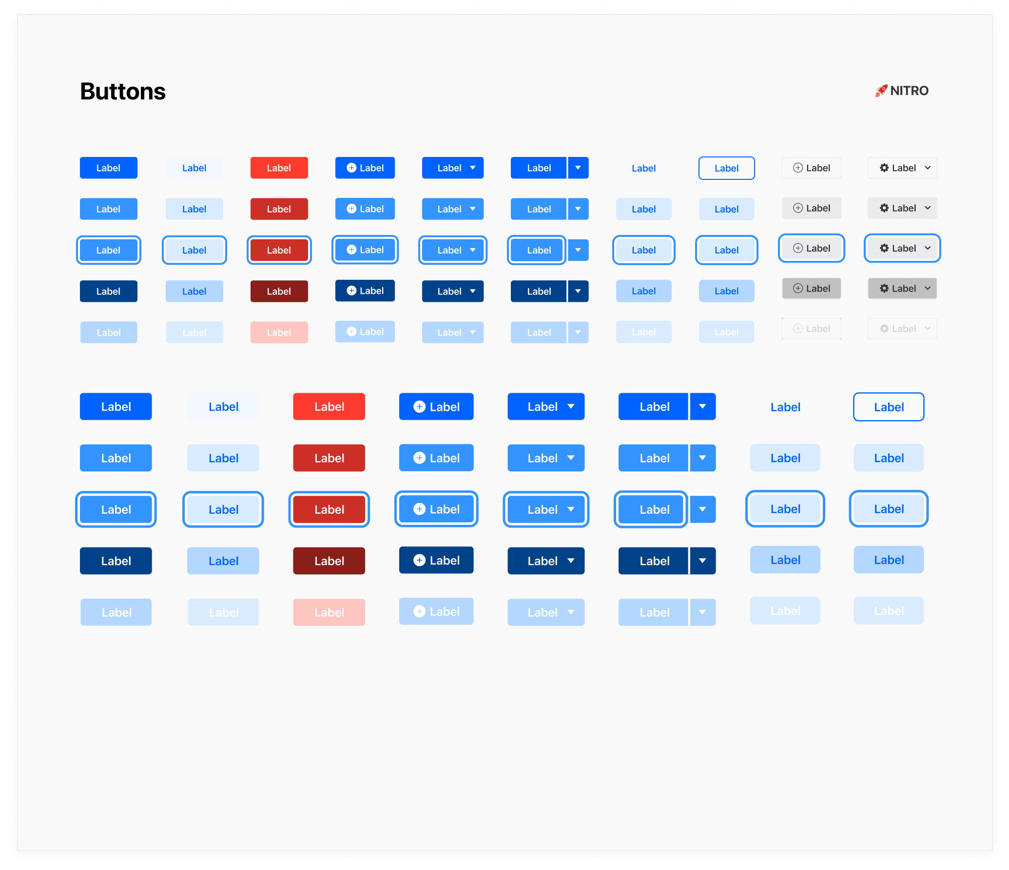
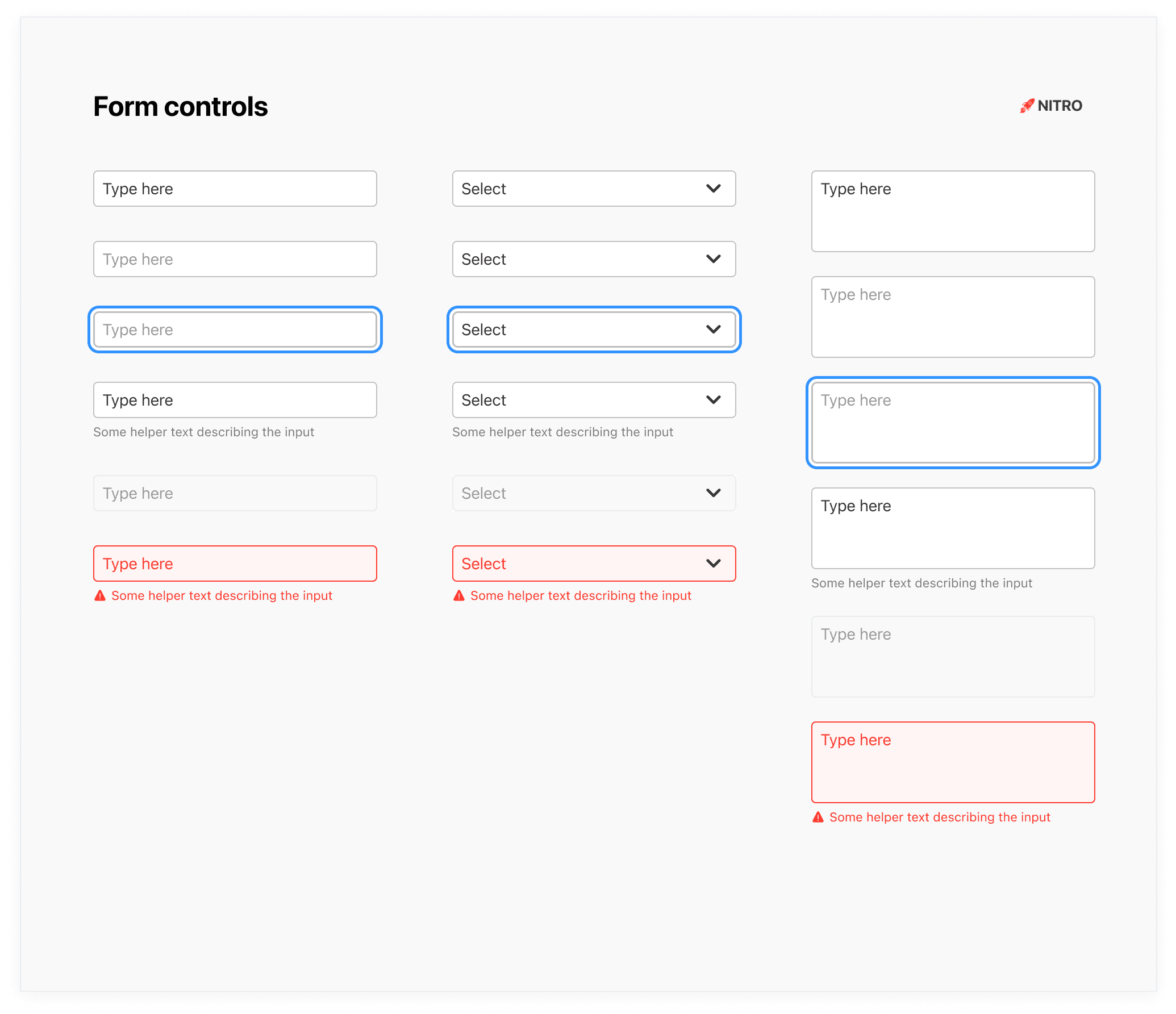
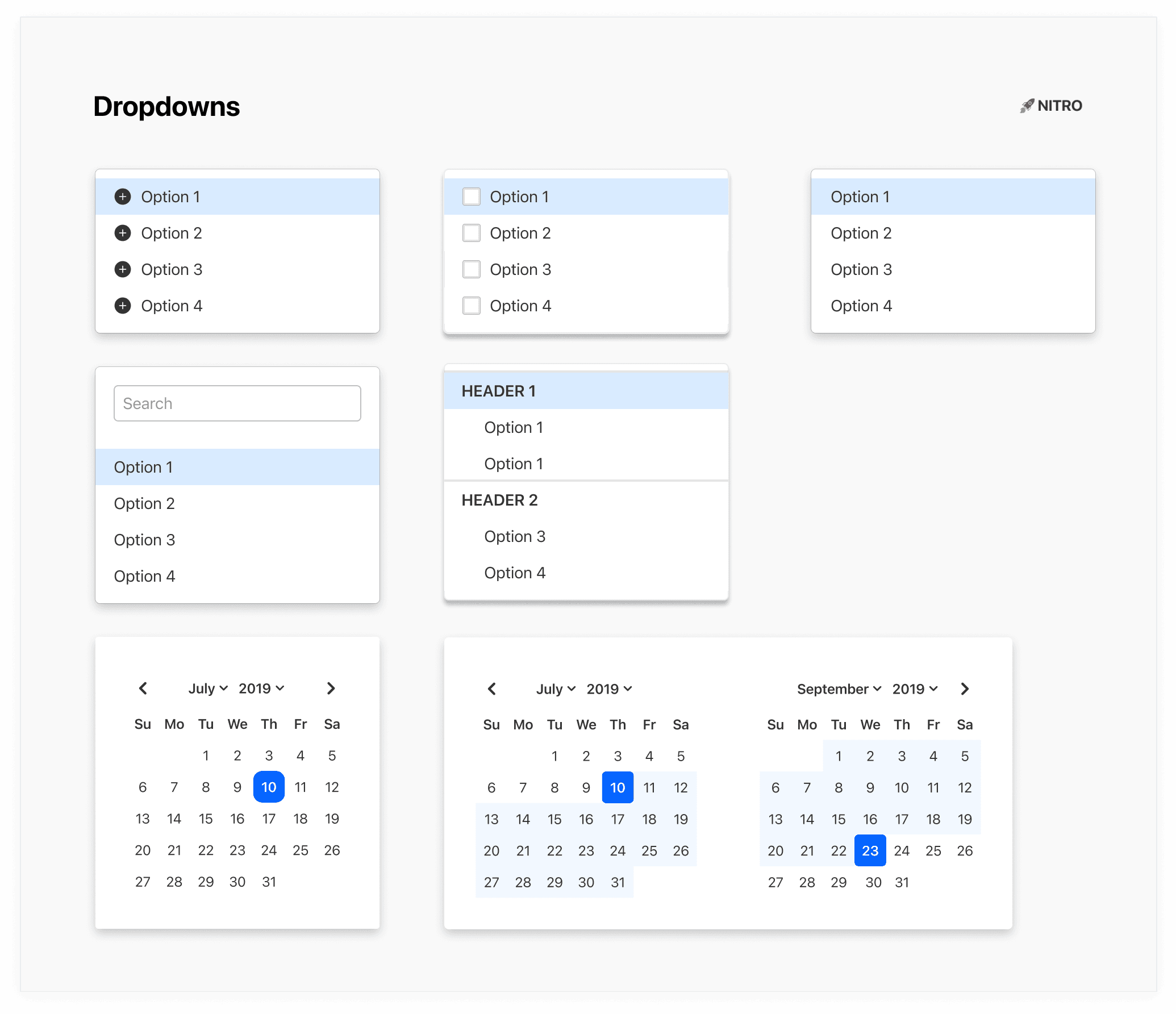
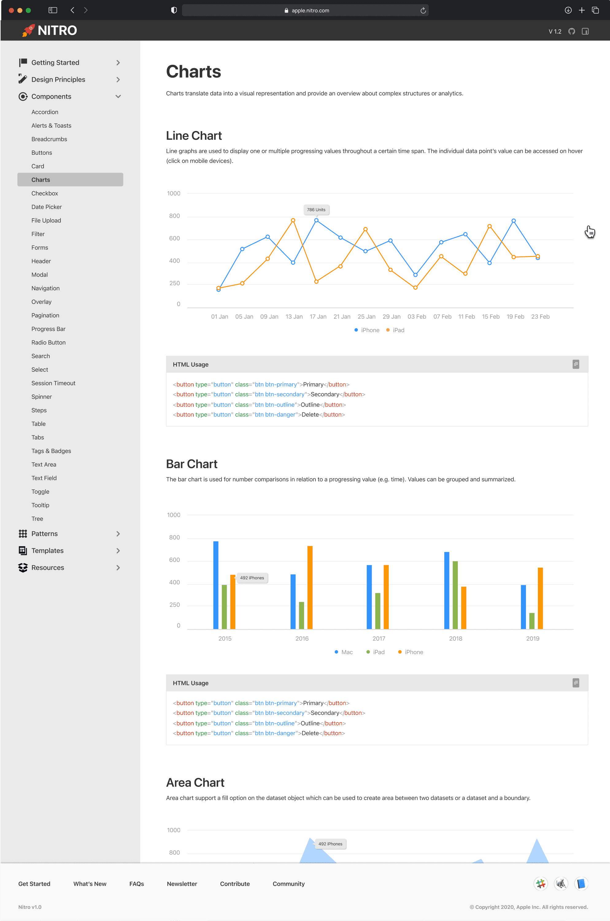
After solidifying these foundations, I started building out basic components such as buttons, input controls, and dropdowns to further strengthen the design system.
DESIGN
Icon font
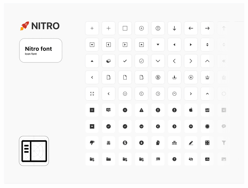
I also designed an cohesive icon set and converted them to icon font using icon moon app. I also constantly updated the icon set to include more icons as the need arose.
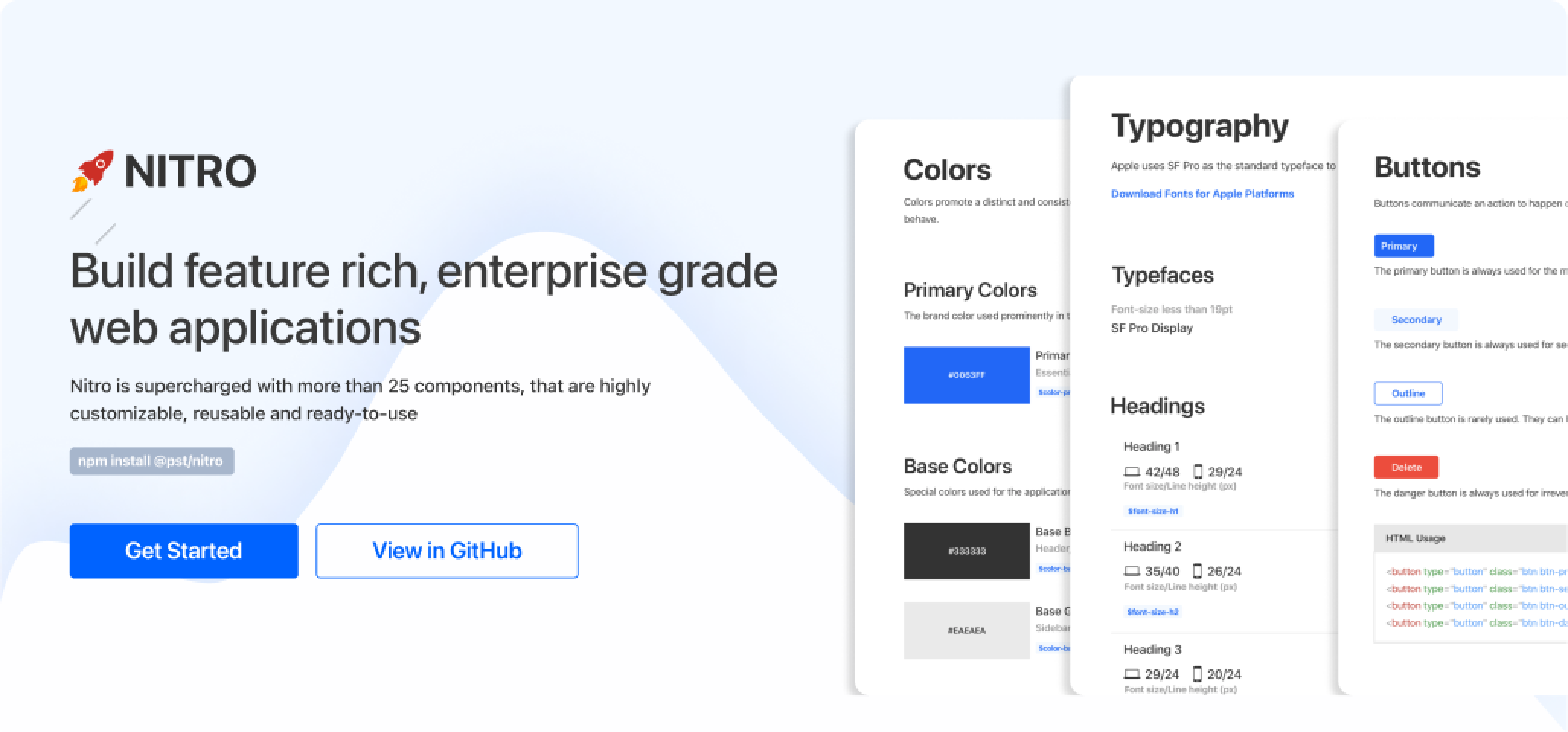
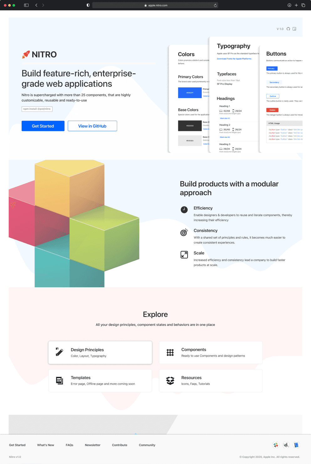
Website
Website
Nitro showcase website was designed as living style guide, it consisted information about components & its variations, component code snippets, design guidance for the usage of components.
Impact
Impact
As result of the success of NITRO, Our team has been assigned to design a new design system which is would used by more than 100+ applications across Apple IS&T.
30+
Components
10
Applications
40%
Reduction in Dev efforts
Compliant
Accessibility
Aravind Rangaswamy · aravindrswamy@gmail.com · 669 225 8310